The TTC font gets the poster treatment
For fans of the TTC's 1950s subway font -- yes, there are some out there -- these posters will likely warm the heart. I discovered them the other day while doing research for another post, and I have to say that I quite like their subtle commemoration of the subway system's original aesthetic.
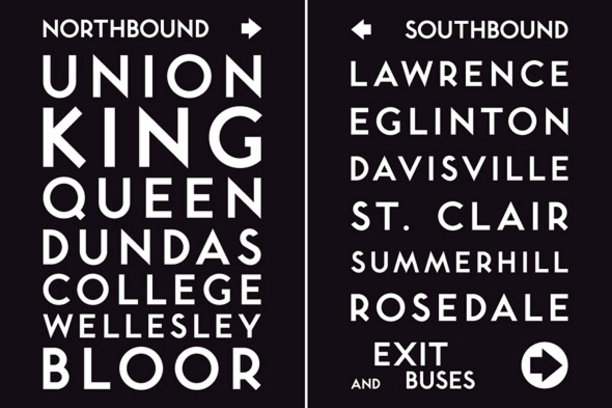
The work ofJonathan Guy, a Toronto-based graphic designer, the posters come in three varieties: two document north and southbound stops on the YUS line and third offers a glimpse at the 42 stations still using the original "Toronto Subway" typeface. Although I do enjoy the simplicity of the black and white versions, I have to say that I'm partial to the colour collection. It's tough to explain, but for some reason that font just gives me instant nostalgia.

Although not really cartographic in nature, I'd group these with Dave Murray'sToronto Word Mapsand theOrk Posters: they're a pretty slick little celebration of our fair city. Alas, if only they were a bit cheaper. $45 is a pretty penny for a poster. On the other hand, I think buying direct from an artist often warrants digging deeper into one's pockets -- but I'm a bit of a disaster with money, so take that for what you will.
Check out larger versions below.


For purchase information, check outJonathan Guy's website.
Update (December 17, 2010):
At the request of the artist, I've replaced the Northbound posters originally displayed here with the version that includes Wellesley Station, which I assume is what people would want to purchase in the first place.
Latest Videos
Latest Videos
加入谈话Loadcomments